

Graphics & Branding

CLIENTS


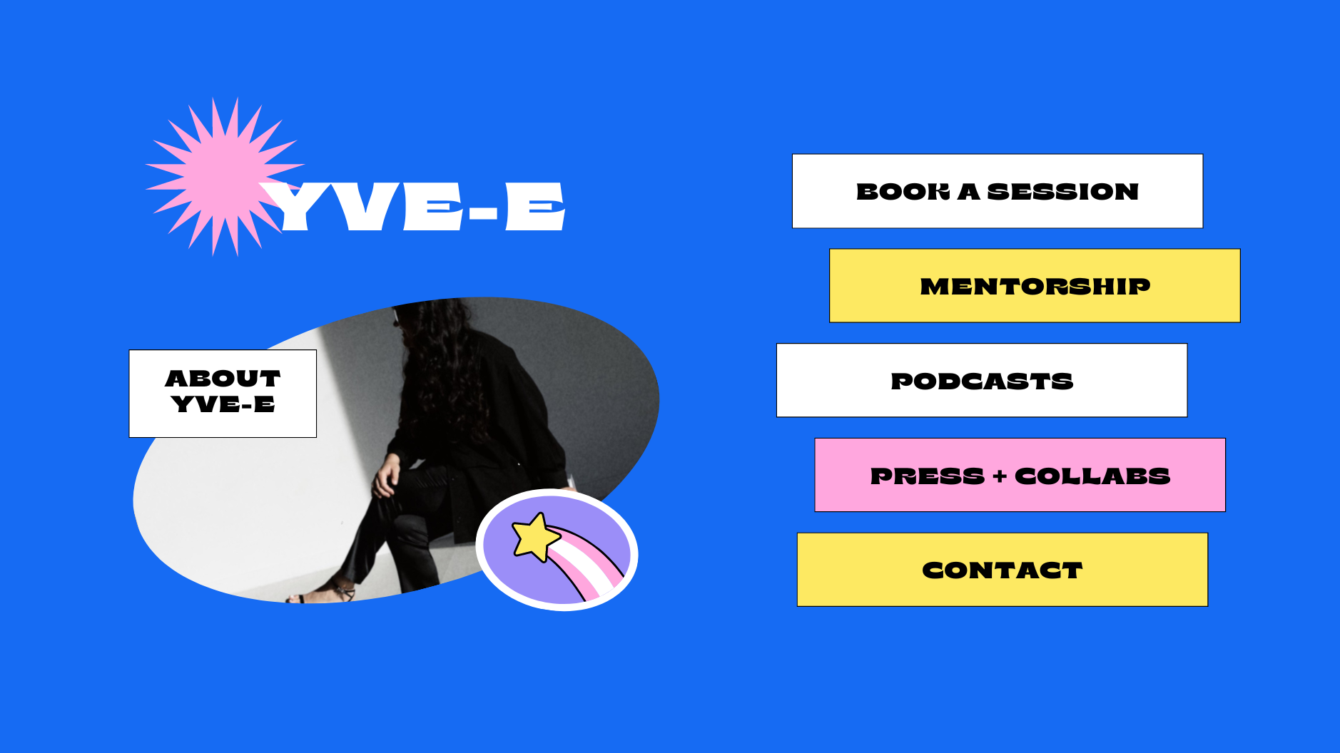
Premier Paws ‘New Product’ Concept design

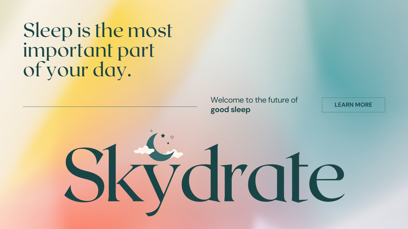
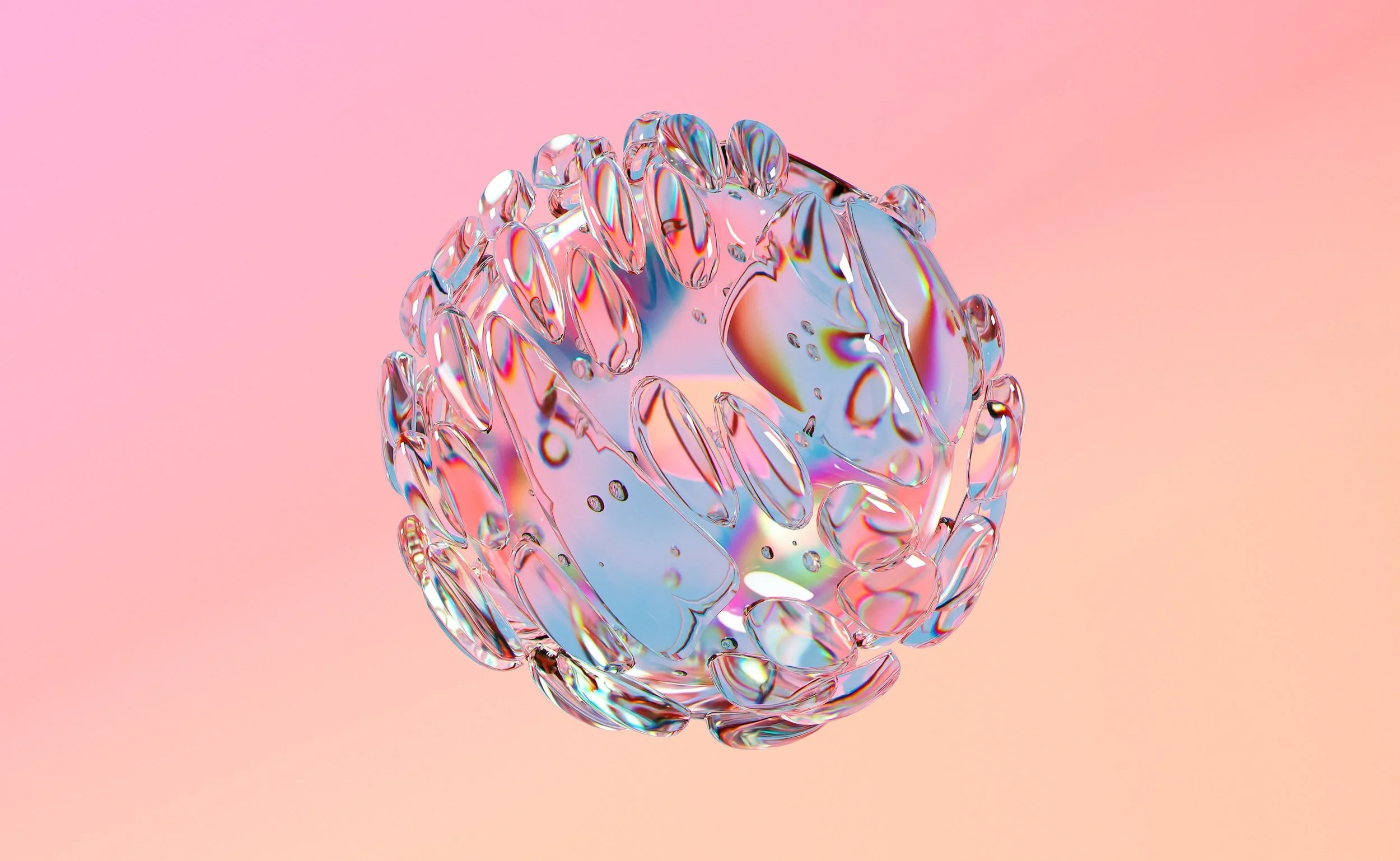
Skydrate Banner Ad - Shopify
Animation Samples


PRODUCTION
Copywrite & design
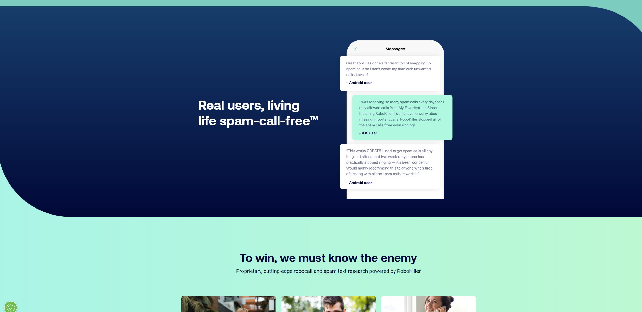
Leaned into the Robot theme - wanted to use inviting and lighter tones of Green & Blue
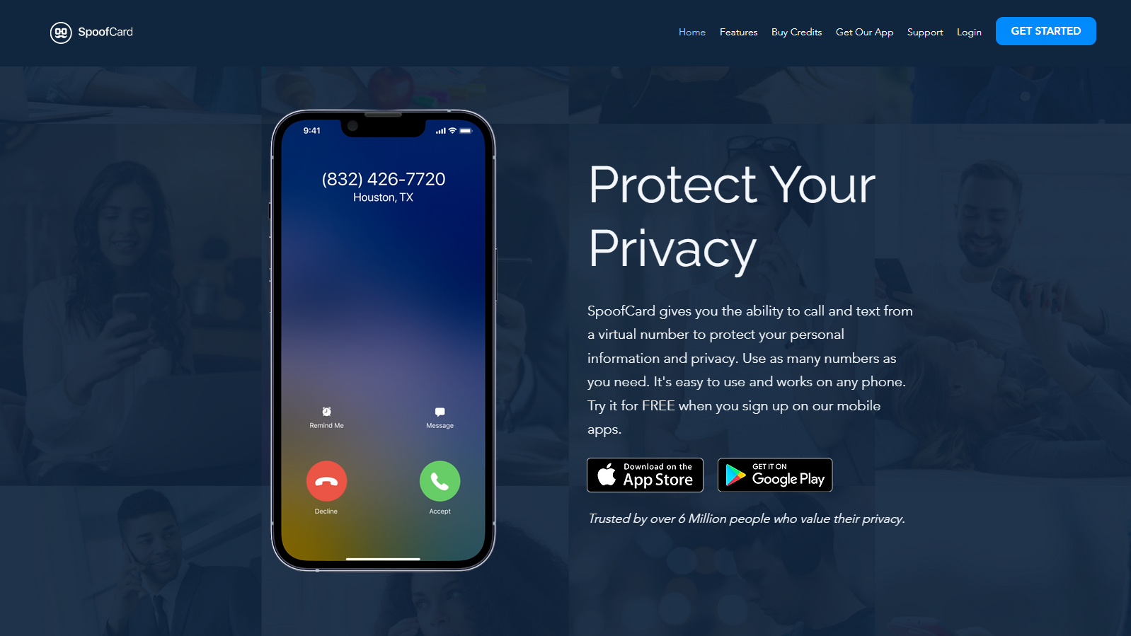
Since the app was getting a lot of heat for being a tool for spammers, we decided to go with a “Protect” & “Family” vibe. We went with safe blue tones and a font style resembling a familiar Apple landing page.
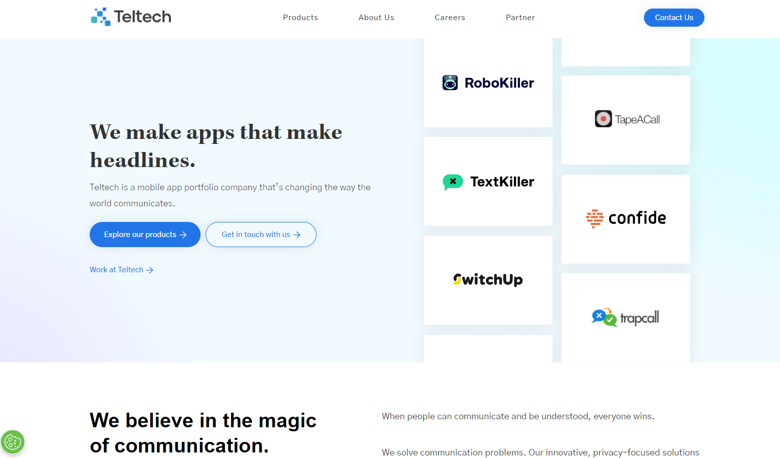
A clean, professional website. The idea was to make a clean presentation and showcase all of the companies other brands.
The task was to show our clients how the app works, right on the landing page. We also needed to make it easy for them to understand the product, in case they start scrolling.
Logos